Project preview
Antal Cosmetology
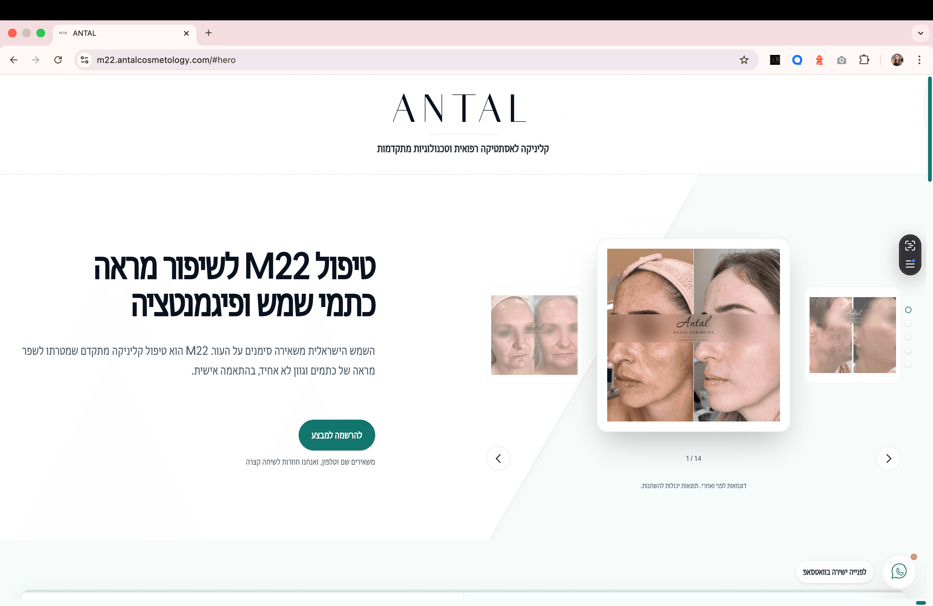
Landing page (M22) — desktop + mobile preview

A premium landing page preview with a focus on mobile flow, clean structure, and a clear CTA — designed to evolve over time.
A clean premium one‑pager: sharp messaging + premium feel
Highlights that made the difference:
- Desktop/mobile mockups that establish a premium visual baseline.
- A message hierarchy that leads to action without overwhelm.
- A foundation ready to expand into services/content later.
A service landing page: one goal, one clear CTA
Highlights that made the difference:
- One page with one intent: understand quickly and reach out.
- Short, structured copy that works on both mobile and desktop.
- A prominent CTA that reduces friction to contact.
Campaign landing: clear offer + clean experience
Highlights that made the difference:
- An opening section that sets the offer and primes the CTA.
- A flow that keeps attention and reduces friction.
- Ready to connect to measurement and iterate later.