Dlatot HaMoshav
A large catalog built like a product
A heavy-content catalog redesigned into a clear, fast, trust-first experience with a shorter path to inquiry.
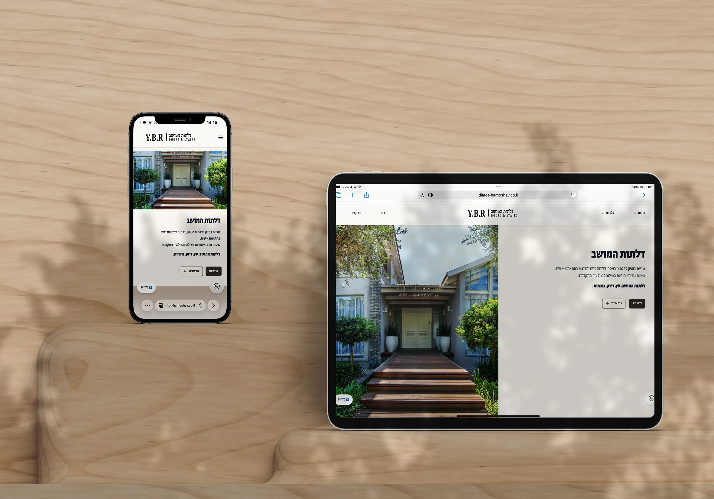
How the information hierarchy behaves on real screens
From hierarchy to gallery: this is how the catalog stays clear on a tablet viewport.
After the trust-first IA was defined, these frames show how that decision behaves on a real tablet: opening, grouped navigation, deeper content, and the gallery grid.


The first impression feels like a premium catalog. Clear, calm, and precise from the very first screen.
Before / After - same product, clearer experience
The focus was clarity, structure, and a cleaner lead path without losing premium feel.
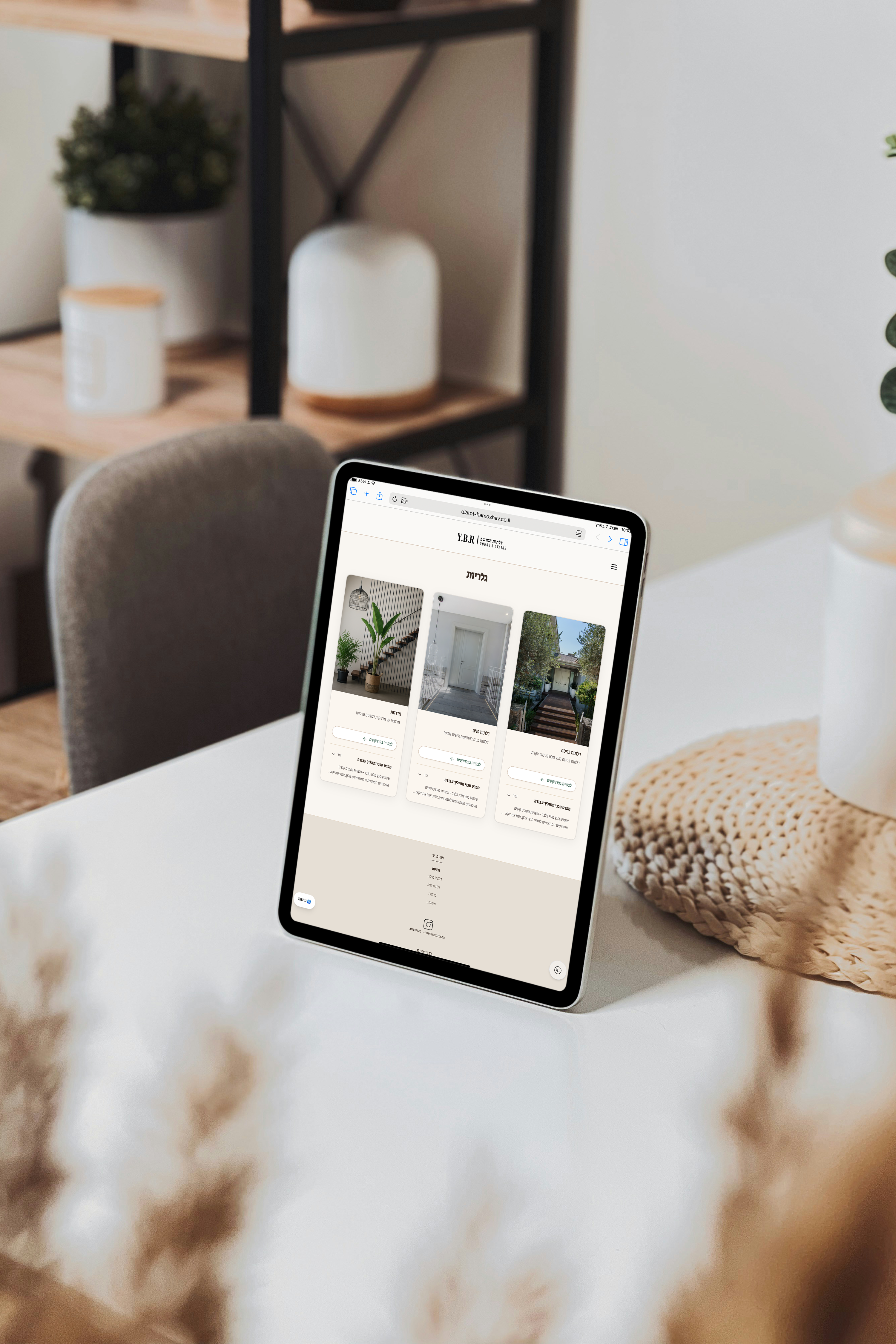
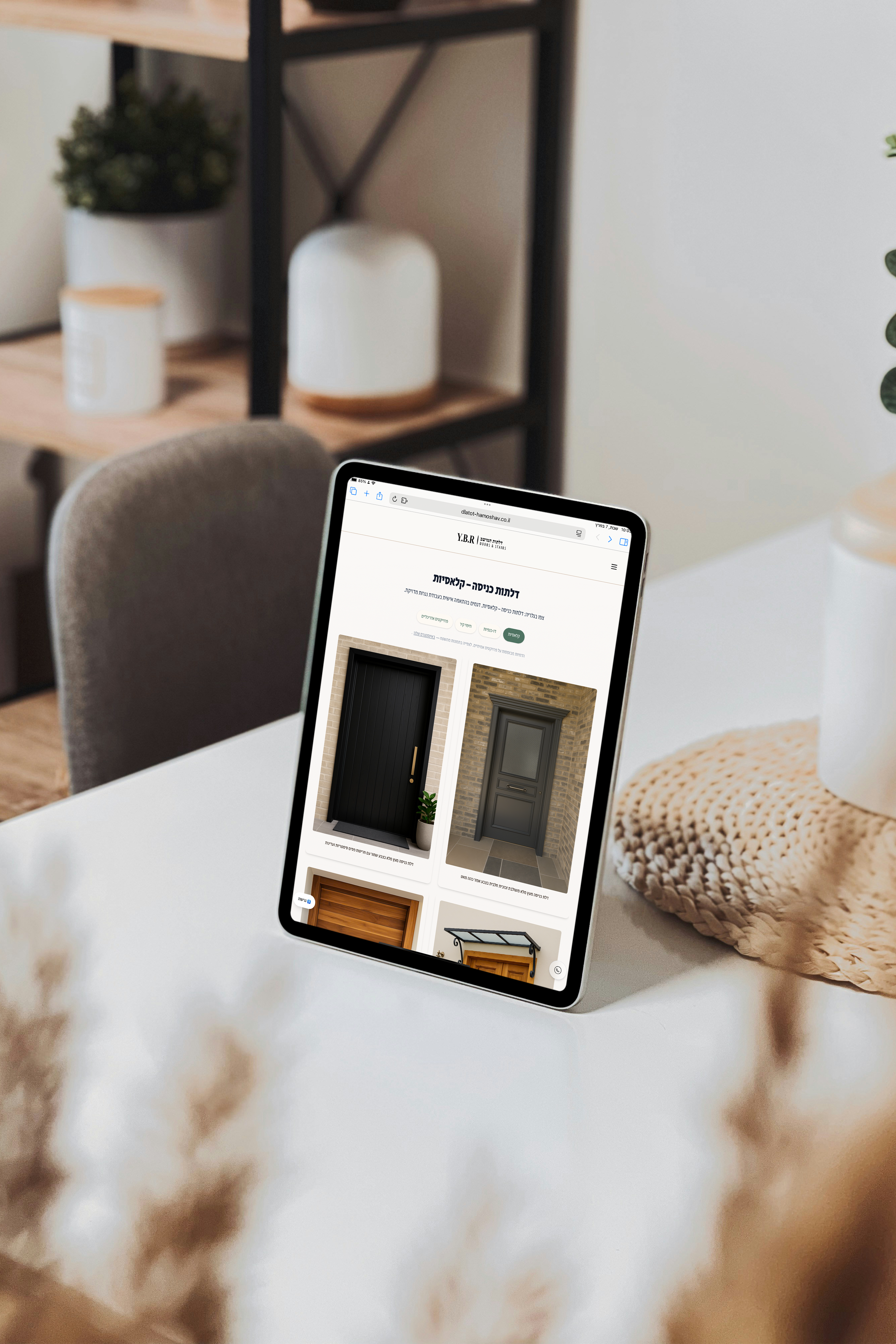
A gallery/catalog with information architecture that makes large variety feel simple
Highlights that made the difference:
- Clear categories and sub‑categories (tabs) so users get to what they need fast.
- A trust path: real photos → renders, with clear context for each type of content.
- Mobile‑first with smart image loading to stay fast on real devices.
- CTAs + measurement along the journey (WhatsApp/form + key clicks).
Boutique presence: clear messaging + clean visuals that drive action
Highlights that made the difference:
- A content hierarchy that explains the offer quickly and reduces bounce.
- A clean design language that highlights the product (not noise).
- Proof placed where it supports decisions — before the CTA.
A structure that guides users without walls of text
Highlights that made the difference:
- Sections organized by intent, so the page feels ‘easy to scan’.
- Mobile readability and spacing tuned for smooth scrolling.
- SEO + measurement foundations to learn what works and iterate.
Want a similar direction for your business?
Start with a quick fit check. We’ll return a realistic range, an initial scope, and the right first metrics to track.