Landing page

Antal Cosmetology

Premium service, clean screen

A landing page that presents a refined service through short hierarchy, clear mobile framing, and one action.

PremiumMobileCTAService
Antal Cosmetology responsive mockup

Landing page

Cosmetology and premium service

What we did

UX, design, development, mobile adaptation, and CTA

Why it works

Visitors understand the feel, the offer, and the next step without heavy copy.

01

Mobile and desktop

The media shows the page feeling instead of explaining it in paragraphs.

Antal Cosmetology responsive mockup
Responsive
Antal Cosmetology top-view mockup
Composition
Antal Cosmetology desktop screen
Desktop

02

Small screen, clear action

Mobile stays short, readable, and action-led without compressing every detail.
Antal Cosmetology mobile screen
Mobile
Antal Cosmetology iPhone mockup
iPhone
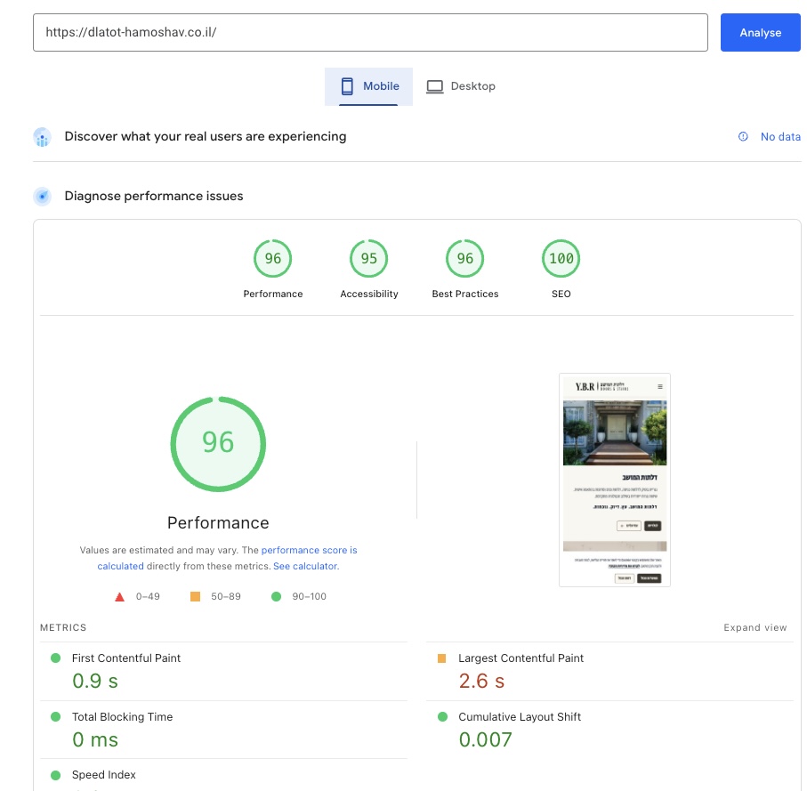
Antal Cosmetology mobile performance proof
Performance

UX / SEO / CONVERSION

A user experience that guides, explains, and builds trust

Every page should help visitors understand where they are, why to trust the business, and what to do next. That is better UX, and it also gives organic SEO a stronger foundation.

01
A clear path on every page
A hierarchy that moves from first understanding to proof, and then to the right action without unnecessary friction.
02
Real mobile-first thinking
Small screens get pacing, spacing, and calls to action that fit how people actually browse by hand.
03
Trust before the form
Proof, reviews, selected work, and FAQs appear where they help visitors make a decision.
04
Smarter internal linking
Navigation connects services, content, proof, and contact so both people and search crawlers can move through the site naturally.
05
Speed and visual stability
Clean structure, stable media, and restrained motion keep the experience readable and reliable.
06
One language across the site
The same level of clarity, visual tone, and microcopy carries across home, services, blog, and contact pages.